After the New York City Taxi & Limousine Commission released their infamous Trip Record Data, there emerged dozens of really great analyses of the data. Conspicuously lacking, however, was a simple visualization of where taxis go. Sure, there are maps of where taxis stop, or which neighborhoods are most popular, but the most interesting picture to me shows the most frequent pick-up/drop-off pairs.
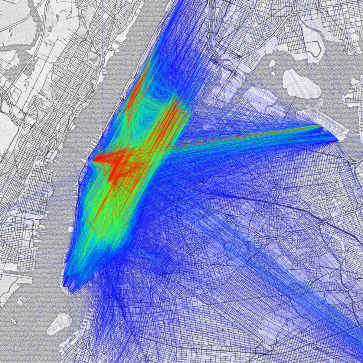 The most frequent taxi pick-up/drop-off pairs in NYC
I think the reason we don’t see visualizations like this are two-fold. First, this is a good high-level view of where people are traveling, we can see quickly from the image that taxis most frequently shuttle people up and down the avenues in Midtown and the East-side, and between large attractions like Javits Center, Penn Station, Port Authority, and Grand Central. These visualizations are less useful, however, for a more in-depth understanding of more nuanced trends, which I think many people are more curious about. Secondly, these graphs are not trivial to generate. The latter point will be the focus of this article. Why these images aren’t easy to make, and various approaches available to tackle the problem.
Displaying data in 2D
If we were only trying to display where taxis picked up passengers (instead of both start and end points) we might start by simply plotting each point on a map.
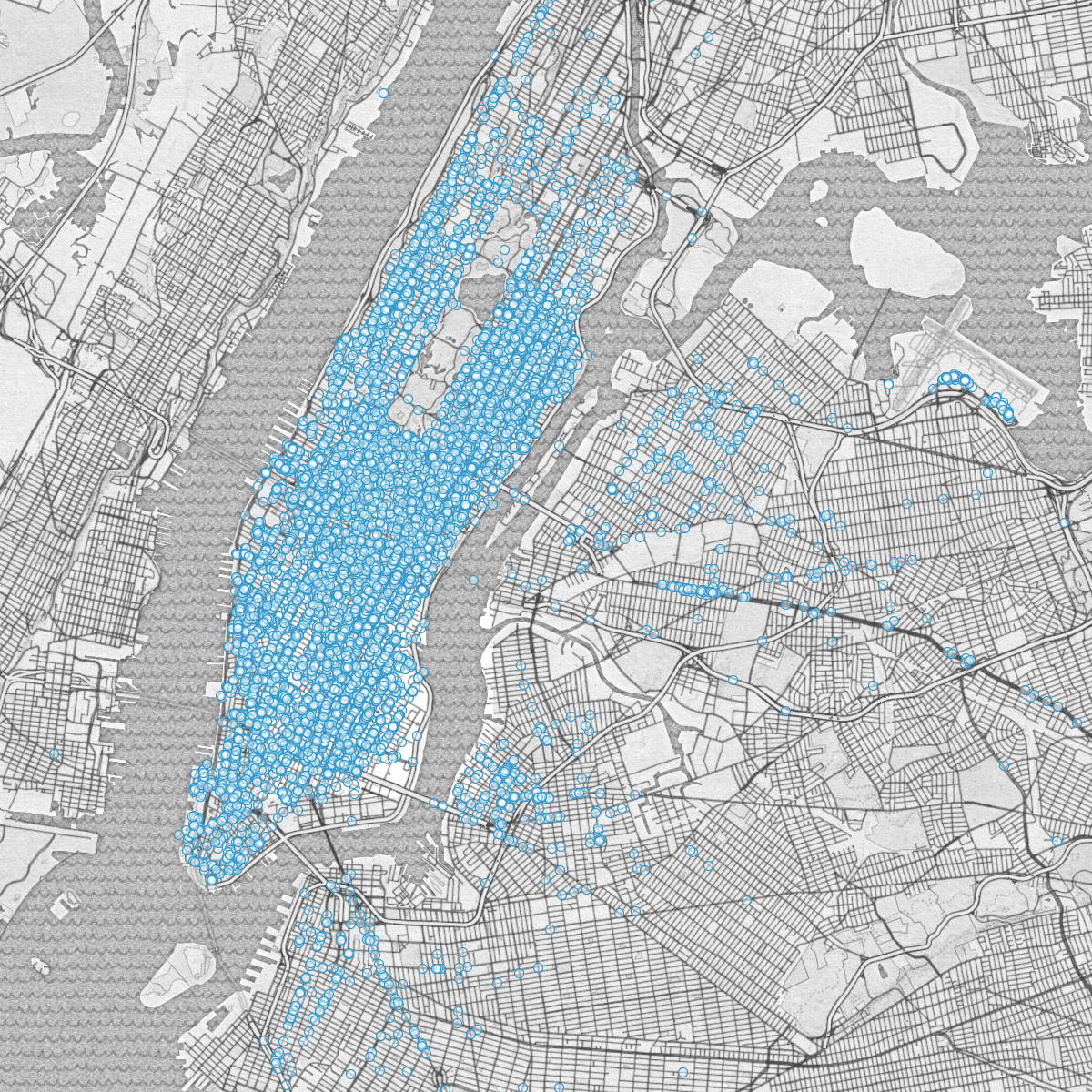 Scatter plot of taxi pick-ups
Unfortunately a scatter plot is only effective until the volume of data reaches an upper threshold. At a certain point the data points start overlapping each other, and one can’t make meaningful sense out of the image anymore. Instead, for large datasets a visual aggregate is preferable. A popular method, and one of my favorites is the heatmap. Heatmaps are a visual representation of the density of your data. In the image, places where data are clustered turn red, and places where data are sparse are blue or green. They let you gather a rough sense of the 2D distribution of your data at a glance.
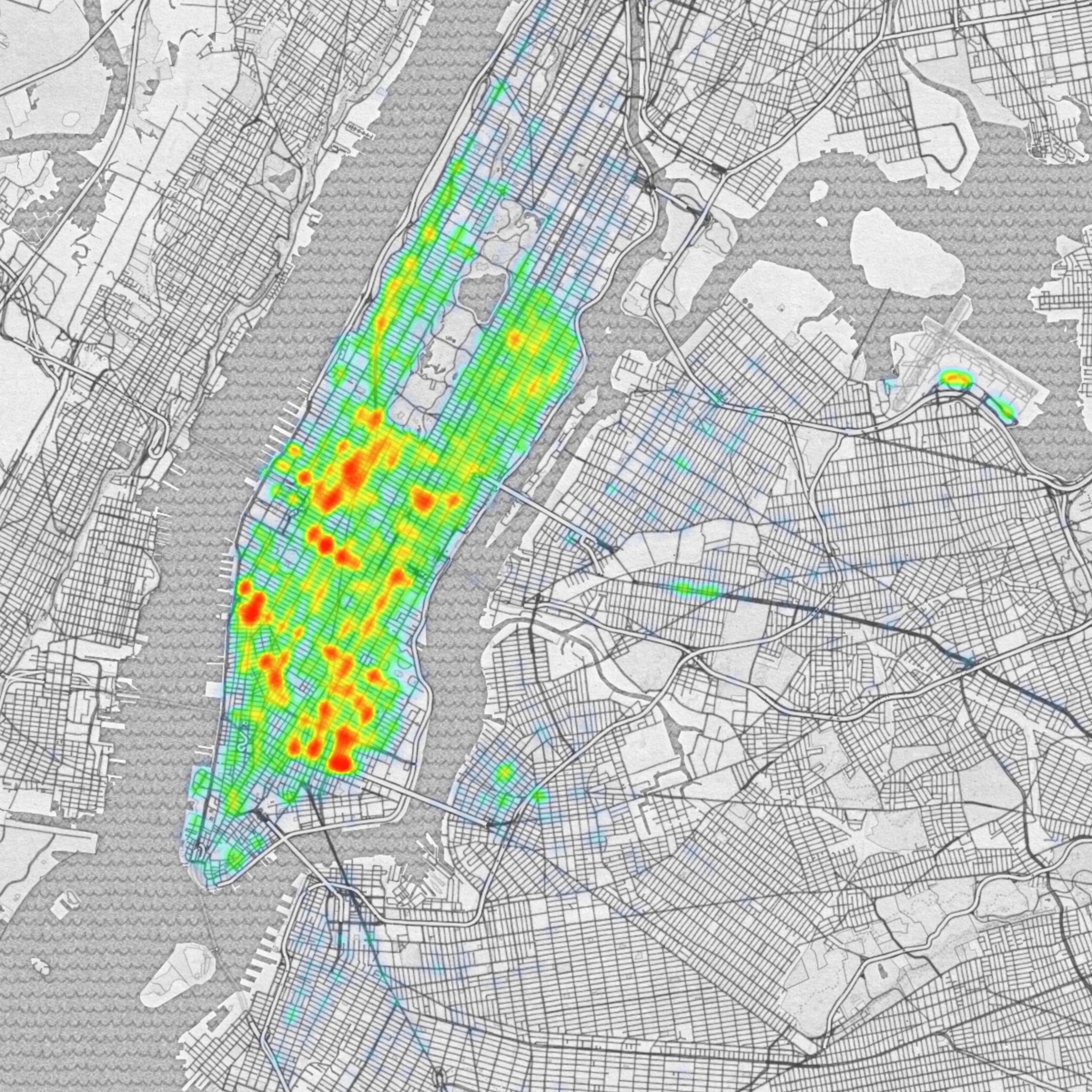 Heatmap of taxi pick-ups
Displaying data in 4D
Even though the heatmap above does a good job of communicating its data, it only shows half of the picture we’re interested in. The heatmap shows the most frequent pick-up spots, it says nothing about where the cabs went from there. The most literal representation is to just draw lines between each pick-up/drop-off pair.
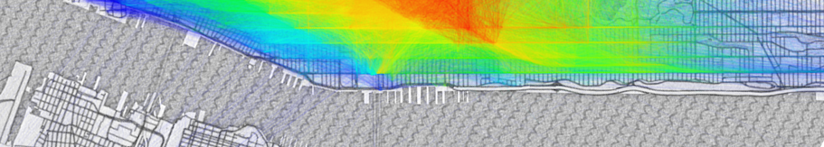
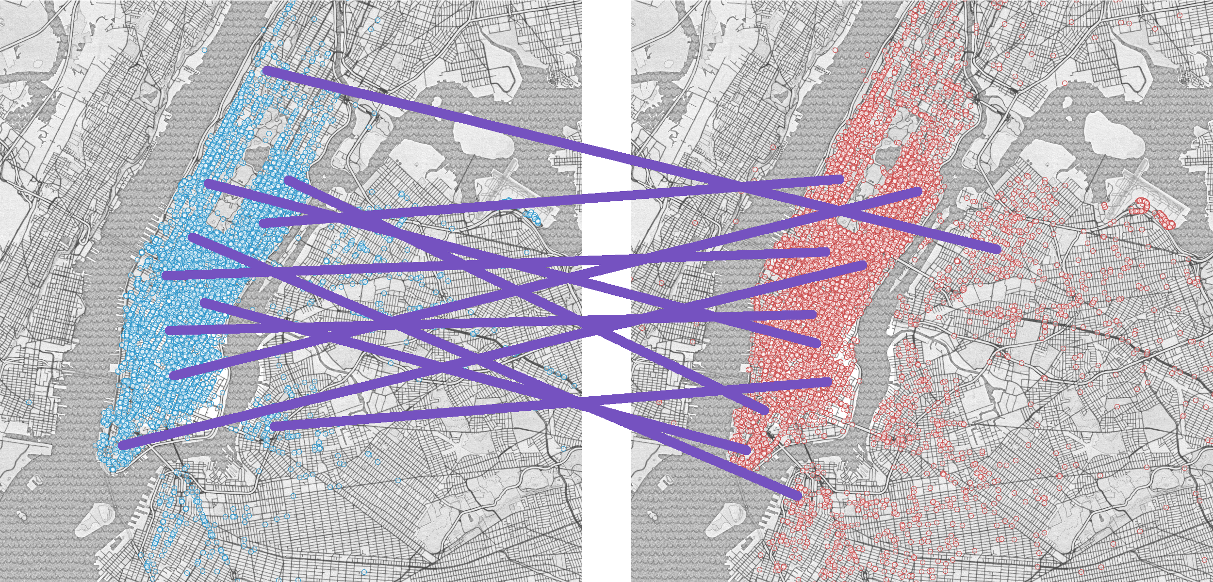 Connecting respective points of two related scatter plots
When the data is shown side by side as above, it can lose its spatial meaning. North/South trips come off as predominantly East/West, and East/West trips lose their directionality. To solve this we could show the data superimposed, however this in turn can become overwhelming with even as few as 1000 points as shown below.
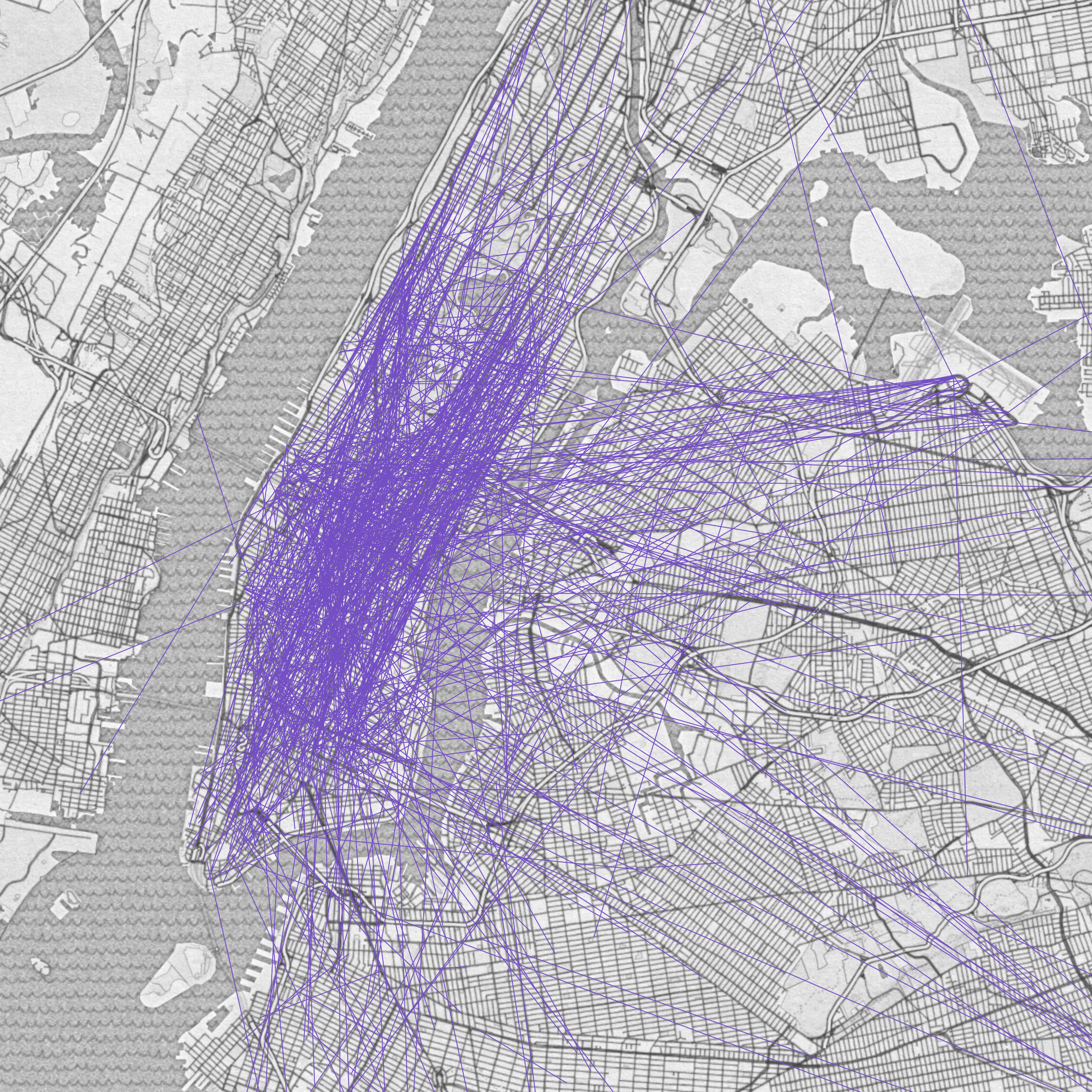 An origin-destination scatter plot
Instead we need a visualization that highlights only the most significant data while retaining its spatial and directional features.
Heatmaps
Heatmaps are images that show data of higher concentration in warmer hues. More abstractly, heatmaps are visualizations of the statistical concept of “probability distributions”. A probability distribution describes how likely an event is to occur given other independent variables. In the case of taxi pick-ups, a heatmap shows how likely a taxi is to pick someone up in a certain location. It moves from facts, how many people have been picked up, to probability, how many people are likely to be picked up. Going from data to probability is often done using kernel density estimation, a similar process to smoothing where we assume that every piece of historical data is actually a historical piece of evidence for a larger underlying trend. When we take 2D data points and turn them into a heatmap, what we’re doing is pretending each data point isn’t an exact piece of information, but instead a fuzzy hint about the world. If someone gets in a taxi at 40th & 8th, we should be able to infer that the region around Times Square is a popular area, not that that particular intersection is more special than any of the other intersections around it.
Practically speaking, to create a heatmap, instead of drawing a dot on a map every time a taxi picks up a fare, we draw a “kernel”, often a Gaussian (also known as a “normal distribution”, though most of the time we use a finite representation, since true Gaussians are defined on an infinite domain), for every data point. We let each kernel reinforce each other kernel drawn before it, such that common areas get very strong values whereas sparse areas have relatively smaller values. More intuitively, it’s like we took a map of Manhattan and built little anthills everywhere a taxi picked someone up, if two taxi’s stopped near each other the anthills would overlap, and that area would grow twice as high, and the highest points are the most popular places.
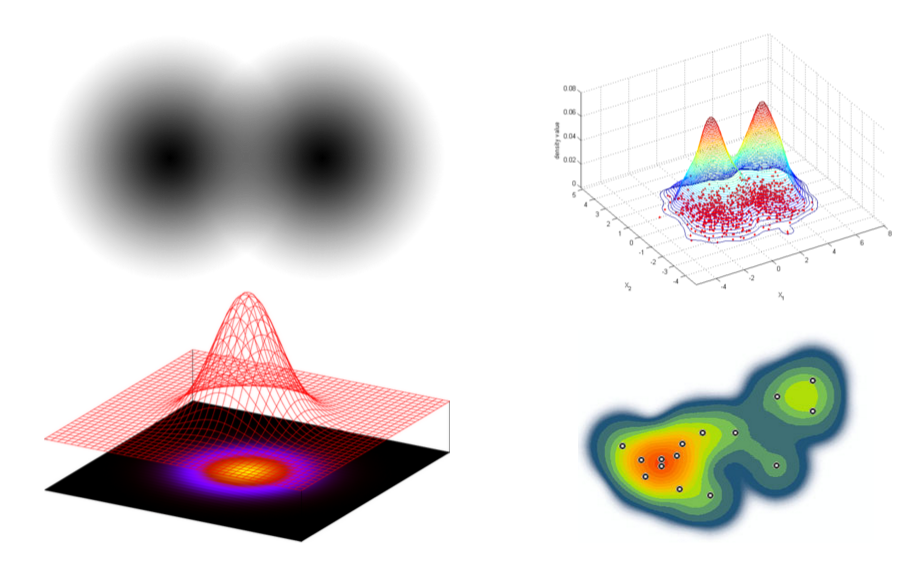 Top left: two gradient stamps of a Gaussian kernel. Bottom left: the relationship between a gradient stamp and a Gaussian curve. Top right: overlapping data reinforce their neighboring anthills. Bottom right: a heatmap from discrete data points
Why 2 Dimensions Aren’t enough
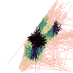
Imagine what would happen if we tried to make a traditional heatmap from origin-destination pairs instead of single points. First we’d start with some lines that represent each trip.
 Three paths that go different places, but cross in the center
In the example above there are two trips that run vaguely vertical and one that runs vaguely horizontal. None of the trips are exactly the same, but ideally we’d see some agreement between the two North/South trips and no agreement between East/West trip and any of the others. If we use the traditional technique of reinforcing every pixel of the source image with a Gaussian kernel we’ll end up with spurious interactions between the data. In two dimensions there’s no way to separate the start/end points of a trip and the line segment between the two. As a result, in the example given above, the central area where all the paths cross becomes reinforced and is represented as the most frequently traveled area even though not a single trip has begun or ended there.
 The 2D heatmap incorrectly highlights the intersection of paths instead of considering trip direction and length
The more accurate solution needs, instead, to find whole paths that are similar to each other, instead of just finding points along the way that are close. A good visualization would show us that the vertical trips are more similar to each other than they are the horizontal trip.
 The ideal heatmap will correlate trips based on their overall similarity, rather than where they happen to overlap
To accomplish a visualization like this origin/destination pairs need to reinforce each other based on how similar the entire path is instead of simply checking where the lines overlap. One way of doing this is by comparing start-points with start-points and end-points with end-points, another is by checking the similarity of the location, direction, and length of each trip. No matter how you slice it, though, it always takes more information that the standard heatmap can account for.
Heatmaps in 4 Dimensions
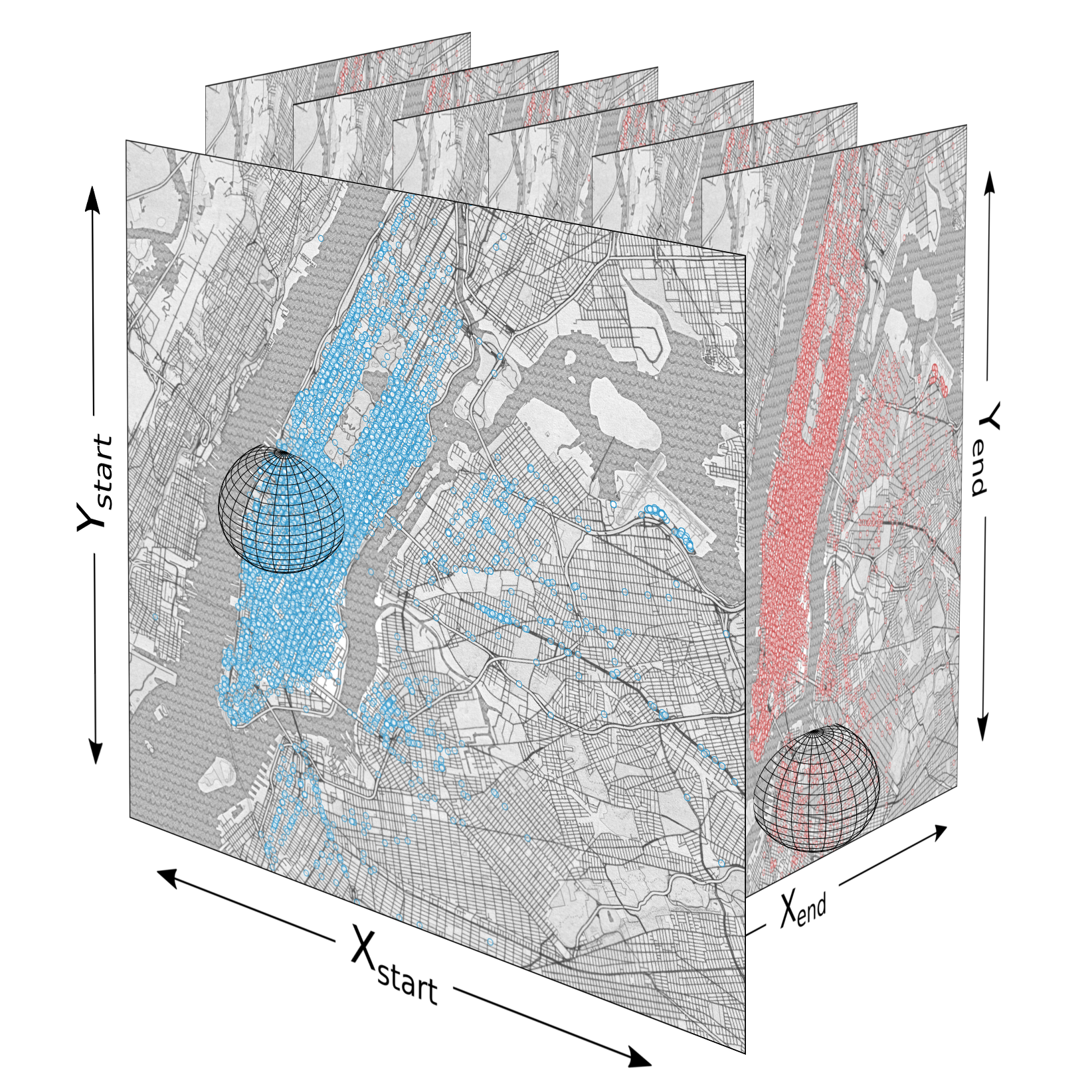
Traditionally heatmaps are mostly used for two-dimensional data, as in our heatmap of taxi pick-ups in Manhattan. The heatmap displays the probability of a taxi pick-up on the surface of the earth which is roughly planar at the scale of New York. The two most common dimensions for describing taxi locations are latitude and longitude. When we start investigating frequencies of both pick-ups and drop-offs, latitude and longitude aren’t enough, because they can only describe either the start of a cab ride or the end, but not both. To describe both ends of a cab ride, we need four dimensions the latitude and longitude of the pick-up, and the latitude and longitude of the drop-off. There are other descriptions of this information that would also work, for example we could use the lat/lon of the start and the distance and direction to the end, however no matter how you manipulate the data representation it’s still 4 dimensions of information.
| 2D coordinates: | (x_{start}, y_{start}) |
| A pair of 2D coordinates: | (x_{start}, y_{start}) \rightarrow (x_{end}, y_{end}) |
| A pair represented in 4D: | (x_{start}, y_{start}, x_{end}, y_{end}) |
Thinking in two dimensions is natural for the human brain since much of our spatial reasoning takes place in the plane, however above 3 dimensions our ability to visualize space diminishes. Geoffrey Hinton, the influential machine learning researcher describes his advice for understanding higher dimensional spaces:
To deal with hyper-planes in a 14-dimensional space, visualize a 3-D space and say “fourteen” to yourself very loudly. Everyone does it. Geoffrey Hinton
Fortunately, unlike with 14 dimensions, we can use some mental tricks to help us visualize the 4 dimensions of our origin/destination data. Since every start datum is just a point on the map of New York, and every end datum is just another point on the map of New York, we can imagine the combined space as infinitely many destination New Yorks embedded in every single point of the origin New York.
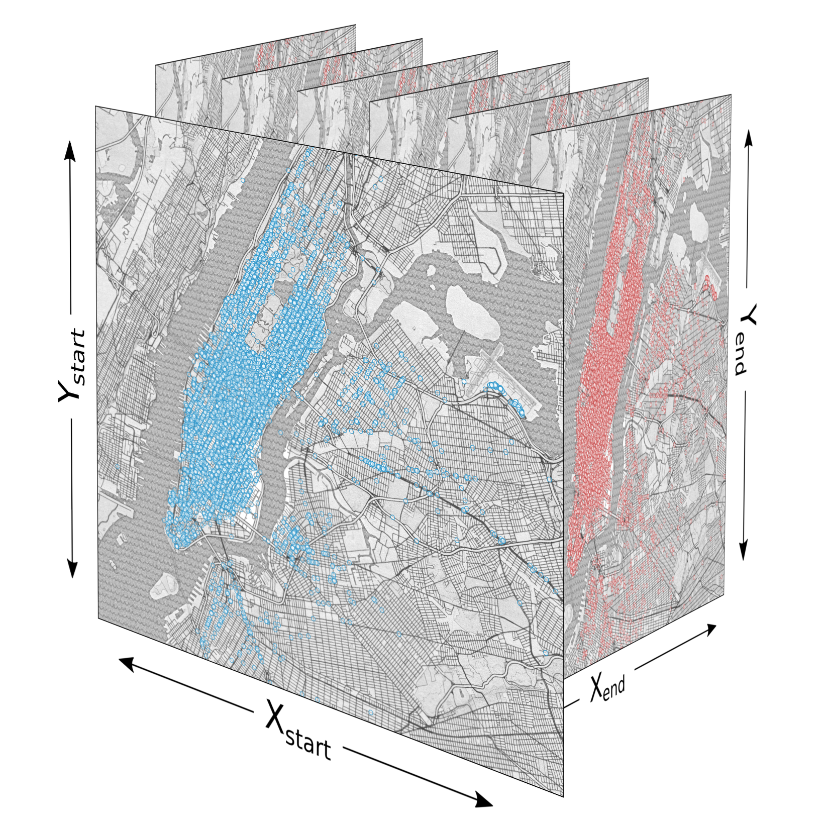 We need to consider two dimensions for the start points and two dimensions for the end points
Once we’ve modeled the data in 4 dimensions we can approach the problem of heatmapping it. Before exploring alternative methods we explore the direct translation of the kernel density estimation method. In 2D each data point is stamped with a Gaussian, each of which are summed together and displayed. In 4D a similar process is possible, except instead of using a radial (circular) Gaussian kernel, we’d need to use a 4-dimensional version. The intuition is that we want to reinforce trips that don’t just have nearby (x, y) start coordinates, but that are nearby in all four relevant dimensions: (x_{start}, y_{start}, x_{end}, y_{end}). Visually the kernel would look almost like a sphere that’s dark in the center and lighter at it’s edges, except instead of existing in only 3 dimensions, it exists in 4. Using the metaphor of nested New York’s, the hyper-sphere kernel would encompass a radius around each point in origin New York that extends into the destination New York and surrounds every point close to the original trip’s own end point.
 A 4 dimensional kernel reinforces points that both start and end near each other.
While a 4D kernel makes a lot of sense as the direct translation from the standard heatmapping technique, it doesn’t scale well in terms of performance. For every point in the data set you need to blit the surrounding datapoints in 2 extra dimensions, and then when it comes time to project all your results back into 2D to make a picture, you must iterate every point. In total the time complexity of this technique is \mathcal{O}(w^4n) for computing reinforcements and \mathcal{O}(s^4) for aggregating the results, where s is the size (resolution) of one dimension of the datastructure (image) storing your points, n is the number of data points (taxi rides) and w is the window size of the kernel (how far you still consider close enough for different rides to be similar). All in all, this method is too slow for too many points of data. It’s especially poorly suited for making high resolution output since the time to generate a result image is proportional to the quad of the length of one side of the output image (or the square of the total number of pixels). The image below took me about an hour of processing time to create and shows only 1600 rides, and is only 150×150px. Doubling the size to 300×300px would require an extra 15 hours of computation, and an image the size of a standard 1080p movie frame would take about 4 months of non-stop pixel crunching.
 The highest resolution image, using kernel density estimation, I could generate in an hour
Histograms
Histograms are a general purpose estimation of probability distributions. They differ from heatmaps in that they’re discrete instead of continuous. The frequency of data are gathered up into bins instead of fuzzy clouds.
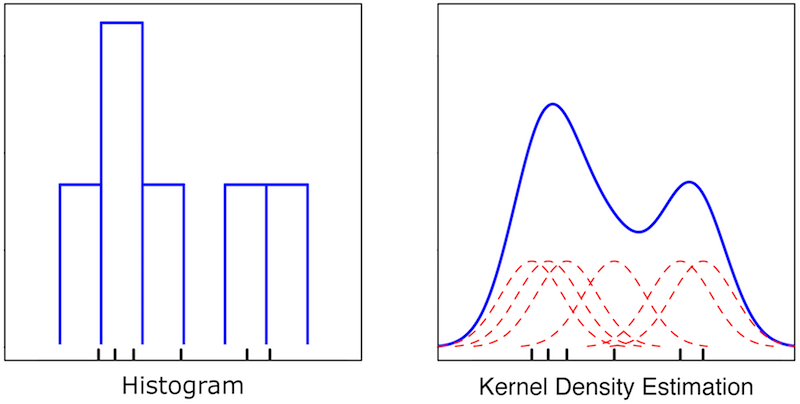 Wikipedia demonstrates the difference between histogramming and kernel density estimation for visualizing data.
Histograms are exceedingly fast to calculate; instead of incrementing a continuous radius around every data point, each data point in a histogram just increments a single counter in a single bin. The down side is that histograms lack the fidelity of heatmaps, the data can have glaring artifacts that challenge the validity of the result. We can, however, get the best of both worlds by meeting in the middle. We can discretize the domain and keep counts of data in bins, but instead of only incrementing a single bin by an integer value, we can have every data point increment it’s bin by a large amount, and a few neighboring bins by smaller amount. This method is slightly more expensive than a traditional histogram, but only by a constant factor, and nowhere near as slow as a comparable heatmap. The result is an algorithm that runs in \mathcal{O}(w^4n) time and \mathcal{O}((s/w)^4) space for computing reinforcements, and \mathcal{O}((s/w)^4) time for aggregating the results, where s is the number of bins n is the number of data points and w is the how many neighboring bins to reinforce.
Additionally, to let the histogram take even less time and space it can be backed by a sparse data structure (say, a hash map), which only allocates spaces for the places in the datastructure that have elements. To get a less discrete coloring upon output, when a point is looked up in a bin, the output color can be interpolated barycentrically (i.e. blend the color of the primary bin, with scaled values from the nearest neighboring bins).
The final customization for histograms is to adjust the bin size to generate images of different coarseness to illustrate different information.
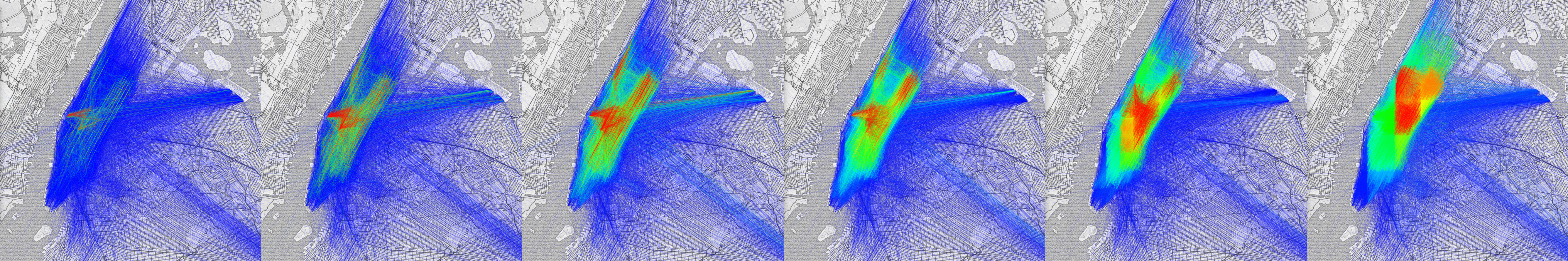 Histograms generated with bin sizes ranging from small to large, left to right respectively. On the left, we can see that small bin sizes emphasize very specific trips that are uniquely common, whereas on the right entire regions are highlighted as being very popular. With larger bin sizes (right) the discrete nature of the underlying datastructure becomes visible.
Ultimately, the 4D Fuzzy Histogram is an efficient probability estimation technique that allows for insightful visualizations of origin destination data. While neither the algorithm or the visualization is perfect in every context, both excel in situations where you want to display a roughly accurate high-level overview quickly and efficiently.