
The spot matrix is a visualization of a table of numbers. It’s used when when you have two discrete axes, and at each intersection there is an ordinal value to be displayed. These charts are derived from Bertin matrices, and serve a similar function as discrete heatmaps, but are in my opinion easier to read, and more pleasant to look at.
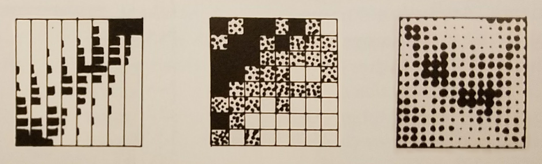 Figure of a Bertin matrix, heat matrix, and spot matrix, respectively from
p. 217 of Jacques Bertin’s 1967 Semiologie Graphique (edited)
I’ll walk through a few alternatives in R using a rather synthetic example. I parsed the source code for a few different parsers in the GCC compiler suite, and counted up the rates at which each one uses various operators. Using this data we can experiment with various graphics for displaying the data. First, the data itself.
ops.mat <-
  matrix(c(392,  114,  250, 115, 115,  78,
           2349, 560,  428, 286, 226, 173,
           4037, 1215, 817, 879, 479, 337,
           966,  592,  142, 256,  90, 407),
         nrow=4, byrow=TRUE)
project.node.totals <- c(28047, 79005, 140853, 29529)

rownames(ops.mat) <- c("go", "c", "cpp", "fortran")
colnames(ops.mat) <- c("a = b","a == b","!a","a && b","a != b","&a")

scale.max.1 <- function(x) x / max(x)
ops.rate.mat <- scale.max.1(apply(ops.mat, 2, '/', project.node.totals))
For the rest of this walk-through you’ll need a few 3rd party libraries.
The only necessary one is ggplot2, but if you want to follow along fully, install the following packages.
install.packages(c("ggplot2", "bertin", "pals", "gridExtra"))
library(ggplot2)
The simplest and most straight-forward way of conveying the operator counts in each parser is in a table of raw counts.
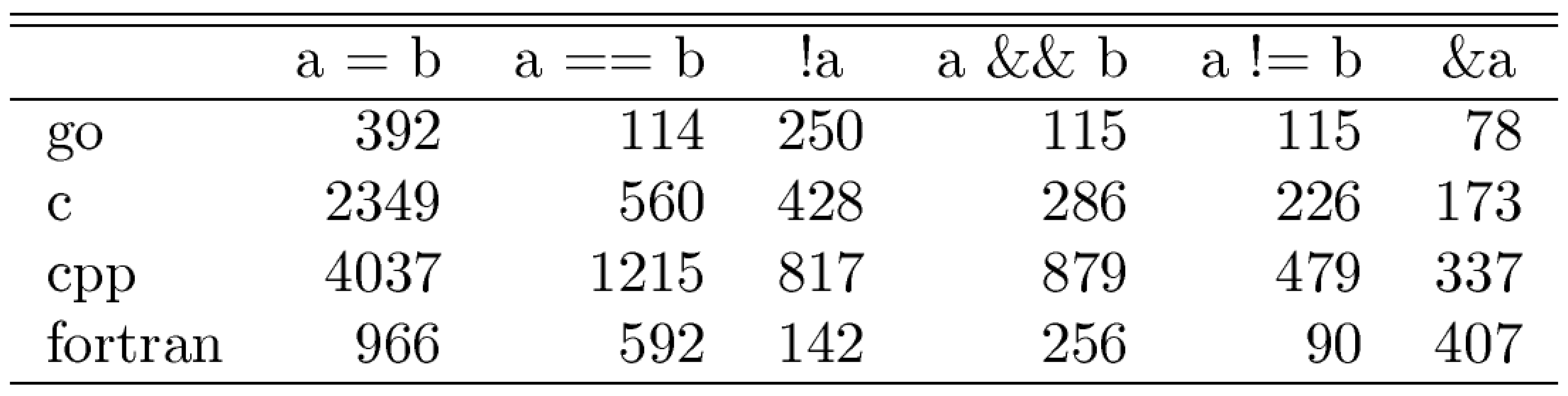
Hmisc::latex(ops.mat, title='')
Table
The table is easy to read, literal, self-explanatory, even elegant if used properly, and not insignificantly, the code to generate a table is quite trivial. On the other hand, it requires the reader to invest a significant amount of effort in understanding the relationships between the data. No assistence is given along those lines.
Part of the motivation of using graphics is to give readers the ability to ‘see’ patterns intuitively in the data, rather than relying on the analytical nature of number crunching. Bertin’s concept was to take every cell and turn it into a small bar-chart like rectangle, in the same spirit as the more modern spark-line.

bertin::plot.bertin(ops.mat, main='', palette = c("black", "black"), showpalette = FALSE)
Bertin Matrix
One problem with Bertin Matrices is that they’re oriented. Each row has a baseline and you must measure the height of each bar from that line. The process is both analytical and hard to measure. It can sometimes feel too cognitive or too inaccurate. To leverage the readers intuitive visual capacity you can replace the heights of the bars with colors. This makes for the traditional discretized heatmap.

heatmap(ops.mat, Colv=NA, Rowv=NA, col = pals::parula(64))
Heatmap
With the heatmap, things get better and worse. You get an immediate impression of the data, which is good. But you lose the ability to make direct comparisons between cells, which is bad. The spot matrix lives in the happy medium between the heatmap and the Bertin matrix.
The simplest spot matrix is made by emiting a point at every axis tick on a grid, with the point’s size scaled to the desired value value.
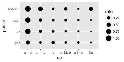
ops.rate.df <- data.frame(melt(ops.rate.mat, varnames=c("parser", "op"), value.name = "rate"))
ggplot(data=ops.rate.df, aes(op, parser)) + geom_point(aes(size = rate))
Vanilla Spot Matrix
A very important point to note when generating this plot in R is that the data must be in “long” or “molten” format.
But the simplest plot to generate has several issues to read. The spots are too small, the axis labels are hard to read, the background is kind of gross, there’s (unhelpful) redundant information in the legend and axis ticks. All of this can be fixed easily with some theming.
spot.theme <- list(
  theme_classic(),
  theme(axis.ticks.x=element_blank(), axis.text.x=element_text(size = 19, angle = 90, hjust = 0)),
  theme(axis.ticks.y=element_blank(), axis.text.y=element_text(size = 19)),
  theme(axis.line=element_blank()),
  theme(text = element_text(size = 22)),
  theme(legend.position = "none"),
  theme(plot.margin = unit(c(10,10,10,10), "mm")),
  scale_size_continuous(range = c(-0.3, 15)),
  scale_x_discrete(position = "top"))

ggplot(data=ops.rate.df, aes(op, parser)) + geom_point(aes(size = rate)) + spot.theme
Themed Spot Matrix
From here, everything else comes down to adding more circles of varying colors and sizes. Below are a series of variations on the classic design that can be beneficial in different contexts.
colors <- pals::parula(10)[c(1,4,7,9)]

plain.spot  <- ggplot(ops.rate.df, aes(op, parser)) + spot.theme + ggtitle("Plain Spot") +
                   geom_point(colour = colors[[1]], aes(size = rate))

donut.spot  <- ggplot(ops.rate.df, aes(op, parser)) + spot.theme + ggtitle("Donut Spot") +
                   geom_point(colour = colors[[2]], aes(size = 1)) +
                   geom_point(colour = "white",     aes(size = scale.max.1(1/rate)))

center.spot <- ggplot(ops.rate.df, aes(op, parser)) + spot.theme + ggtitle("Center Spot") +
                   geom_point(colour = "gray20",    aes(size = 1)) +
                   geom_point(colour = colors[[3]], aes(size = rate))

ring.spot   <- ggplot(ops.rate.df, aes(op, parser)) + spot.theme + ggtitle("Ring Spot") +
                   geom_point(colour = "black",     aes(size = 1)) +
                   geom_point(colour = "white",     aes(size = 0.8)) +
                   geom_point(colour = colors[[4]], aes(size = 0.81*rate))

gridExtra::grid.arrange(plain.spot, donut.spot, center.spot, ring.spot, nrow=2)

In my opinion the last chart, which I like to call the “Ring Spot” design, has the best blend of clarity and aesthetic appeal.
Once you’ve selected the type of spot matrix you like, you can then customize it to your data. For example I recently had a situation where I needed to display grouped data. A natural way to indicate categorical relationships between data is with color.

op.type <- factor(c(1,2,2,2,2,3), labels=c("assignment", "logical", "address"))

ggplot(ops.rate.df, aes(op, parser)) + spot.theme +
    geom_point(colour = "black", aes(size = 1)) +
    geom_point(colour = "white", aes(size = 0.8)) +
    geom_point(aes(colour = op.type[op], size = 0.81*rate)) +
    scale_colour_manual(values = colors[2:4])
Grouped Spot Matrix
There is no one right visualization for any project, and each has its pros and cons. For me, however, the spot matrix has come in handy in a number of applications. I think you should consider using in situations where:
- Your data has two categorical axes
- The order of the axes are reorderable
- The values are ordinal
- The plot needs to deliver high-level information quickly to the viewer
- Aesthetics matter
If you think using a spot matrix might be right for you, go ahead and give it a shot. The full R code for this post is available here.